Building Good Ads
 Faraz Prentice-Khan
Experiments with AI-native ad formats
On October 27, 1994 the first banner ad went live. Four years later researchers coined a term: banner blindness.
It came from a study that found that making an ad stand out with bright colors did not make it easier to find. Only 24% of participants noticed banners containing the information they had been tasked to look for. Ironically, as the web exploded and attention-seeking banners became the norm, people stopped noticing them; to the point that the average display ad gets clicked just 0.05% of the time.
Nobody has worked out yet what an ad should look like inside a generative interface. We know someone eventually will, and we want a hand in making sure it’s done right. At Koah, that means building good ads for the internet of AI.
Historically, ads have been built to serve one party. We think a good ad has to answer to three: the person seeing it, the developer whose product it sits inside, and the advertiser paying for it. Which is to say: an ad needs to be worth the space it takes up, it needs to belong on the page, and it needs to perform.
Each of the formats below started as an attempt to serve all three parties at once. After testing them across our network of millions of impressions in AI chat surfaces, here is what we’ve learned.
The Formats
Card (Text)
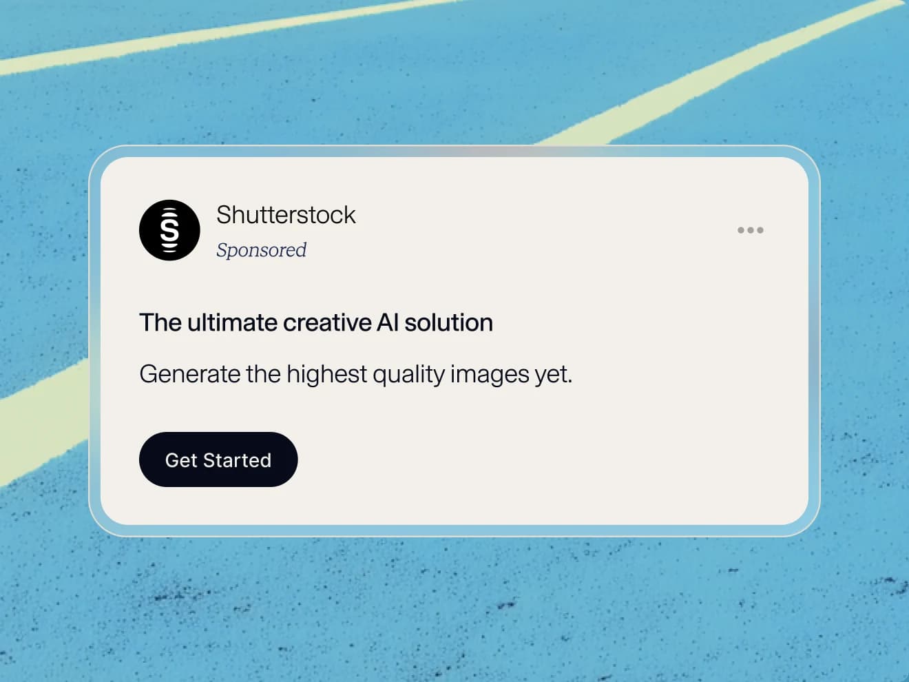
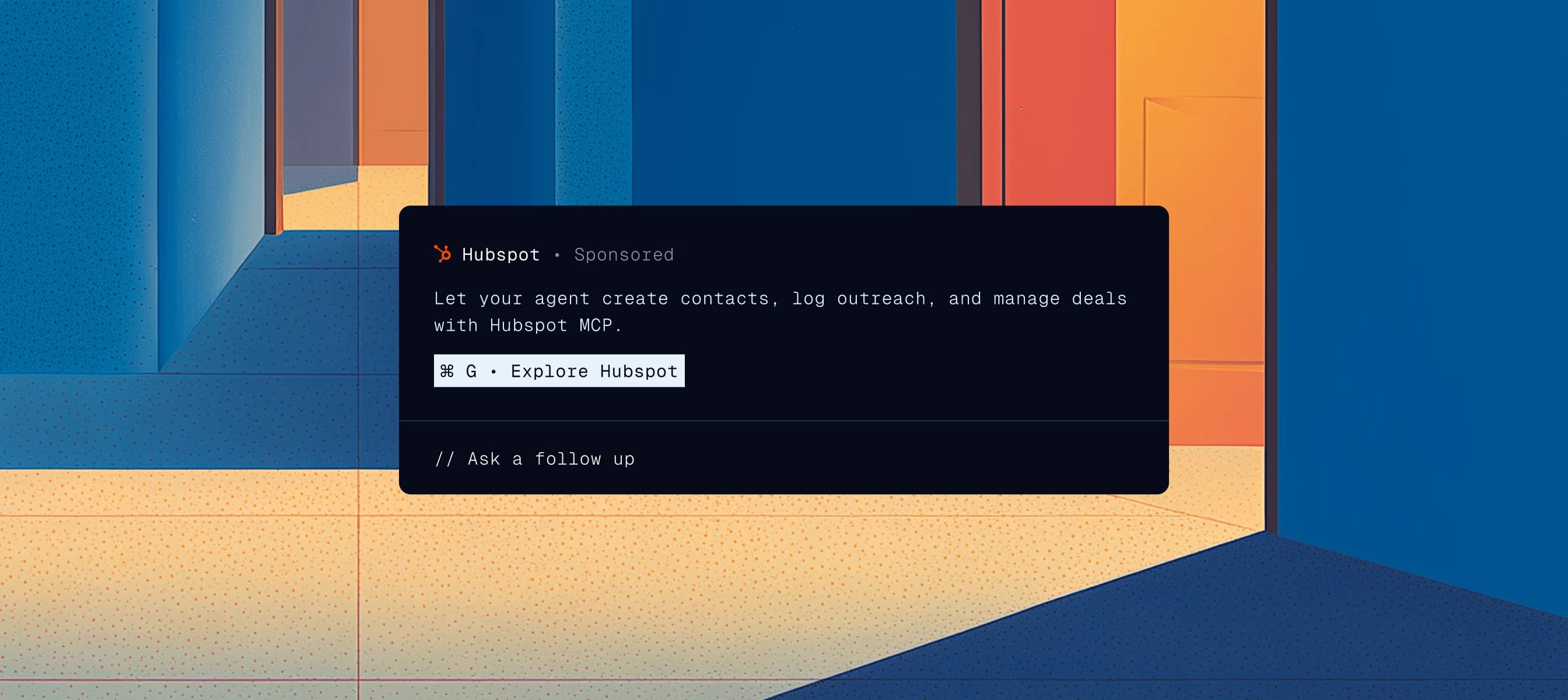
Our Card (Text) format is our first and longest-running ad. It performs at a 1.96% click rate, roughly 40x the average of display ads. It is also the most understated format we make, containing just a headline, a few sentences, and a link, set in the same type as the chat.
What it lacks in ornament it makes up for in relevance. The copy is generated in real time to match the conversation it lands in. This ensures the advertiser’s brand copy is written for the moment, the developer gets a unit that matches their interface, and the user gets information about a product related to their query.
Side Rail
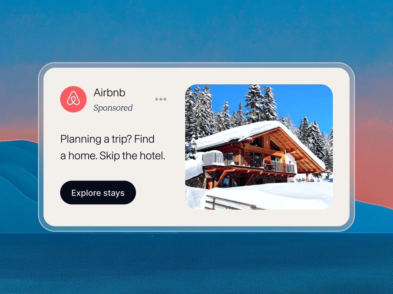
We started with text because text is what an AI conversation is made of. But an image does something a sentence cannot, and our own numbers agree: on mobile, a Card carrying an image drives a 13.27% higher CTR than ads without one.
But in some cases when we added an image to our Card (Text) format, the unit grew too tall and crowded the answer. So we turned it on its side and gave the image the margin instead. This became our Side Rail format. It performs 2.4x better on mobile than on desktop, where the ad takes up a larger portion of the screen and, at first sight, a customer once praised it as “beautiful.”
Poll
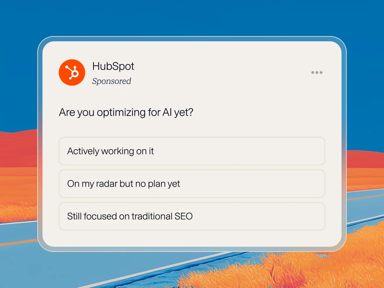
Our poll ad is self-explanatory enough: a user sees a question with a few options underneath it and votes by selecting one. The interesting part is how the questions and answers of this format are created. They can be written by the advertiser, but most are generated by a model based on the conversation the ad is served in. In this way, Poll ads reflect the reciprocity of generative AI surfaces themselves: they listen to what someone tells them and respond rather than outright telling someone what to do next.
The interactivity of these ads drive engagement. Of the people who vote in a Poll ad, 9.58% go on to visit an advertiser's site.
Expandable
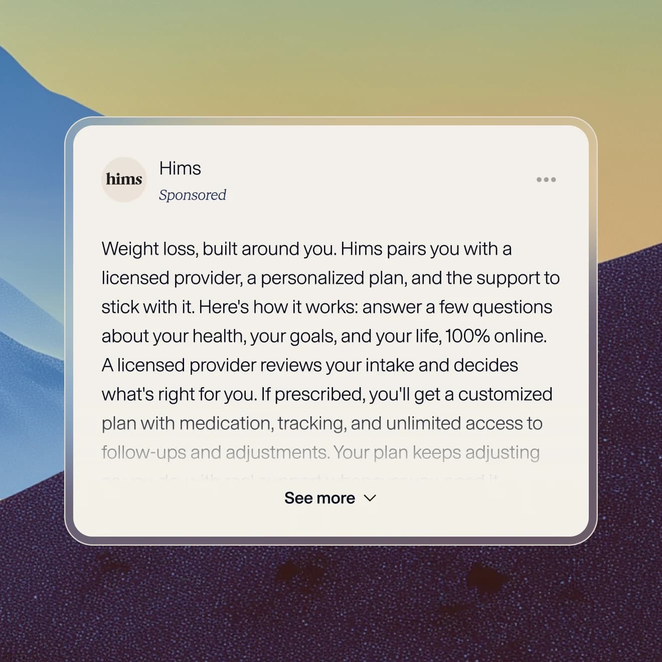
An expandable ad shows a headline and a sentence, with the rest of the copy folded behind a button. Tapping it opens the full text in place without sending anyone anywhere. For users who are curious but not committed, it provides a low-effort way to learn more about a brand without leaving the conversation.
We see users expand this format three times as often as they tap a button to link out to an advertiser’s site. The rest keep reading the answer they came for, which is also an outcome this format was designed around.
Quick Pick
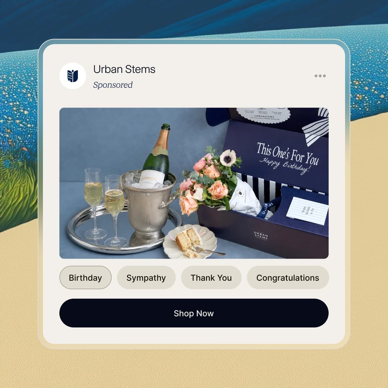
Quick Pick is one of our newest formats and a culmination of everything we’ve learned from our explorations before. It shows a handful of options as a visual shortlist. Tapping one narrows the ad to that choice.
There is a rule our format testing keeps proving: users decide what to do with an ad in the first second. A shortlist is a lot to put in that second. Our bet is that choosing from three visually-enticing options is as attractive as reading a headline.
Of the people who choose an option in our Quick Pick format, 10.67% go on to the advertiser's site.
Concluding Notes
A few things we are taking from our explorations:
-
Ads can be beautiful.
-
Good ads fit the surface in which they are served.
-
Engagements like expanding an ad or voting in a poll are new kinds of signals that point to ads that can be more useful than they’ve ever been before. We are just getting started in understanding how to value these actions in the user journey.
We are also studying when an ad belongs in a generative conversation and how it can add to that conversation rather than distract from it. People learned to ignore the ads of the early web because those ads were constant, loud, and beside the point.
We would rather build something different.