Ads Were Never Supposed to Be Ugly
The first ads made you feel something.
A Coca-Cola lithograph that made a five-cent drink feel like an occasion. A Paramount illustration so rich you could smell the popcorn.
These were not interruptions. They were pieces of art. Copywriters and art directors on Madison Avenue obsessing over every word, every frame, every inch of negative space. A human editor at the newspaper verified relevance before anything ran. The ad existed alongside the content because it had to. Same paper, same ink, same grid.
Then the internet happened.
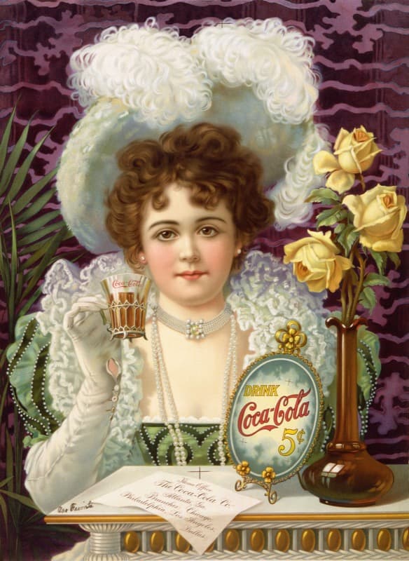
Coca-Cola, c. 1900
Lithograph on paper
Among the earliest branded print advertisements in America.
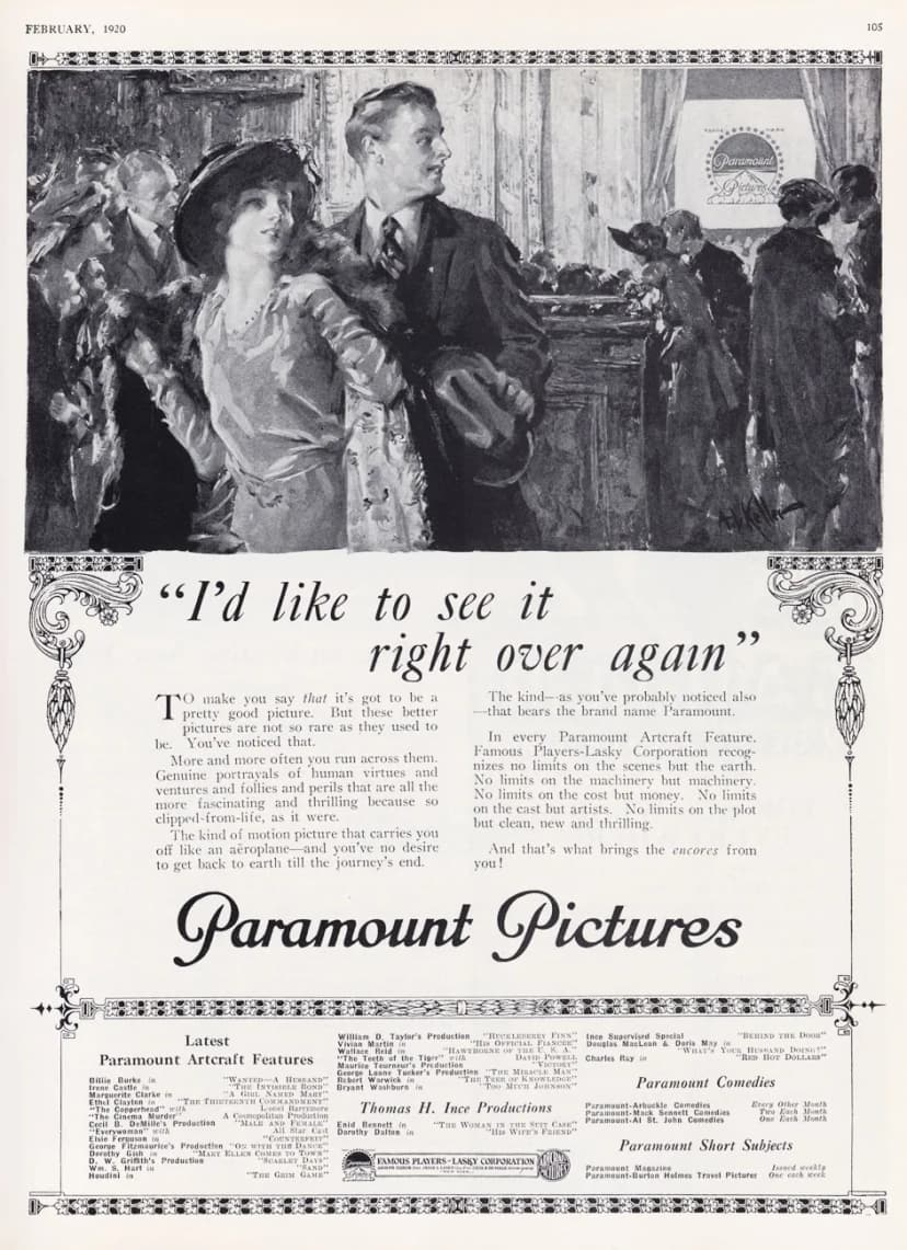
Paramount Pictures, 1920
Famous Players-Lasky Corporation
When movie ads were illustrated like the films themselves.
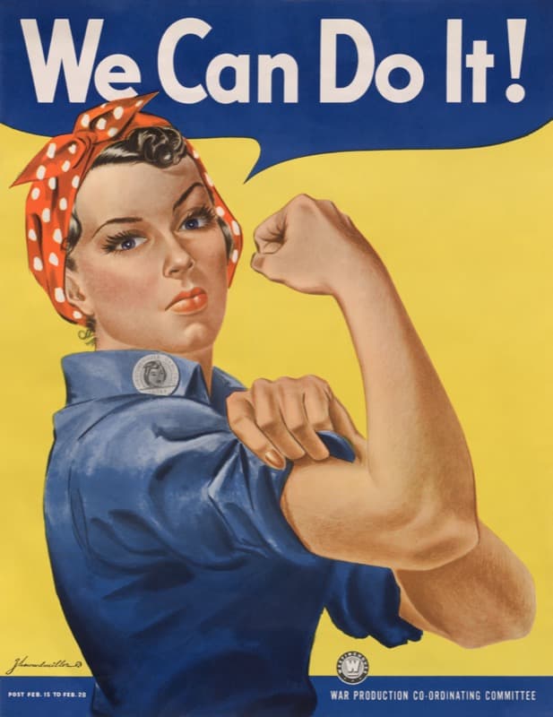
'We Can Do It!', 1943
J. Howard Miller for Westinghouse Electric
Originally an internal morale poster. Now one of the most reproduced images of the 20th century.
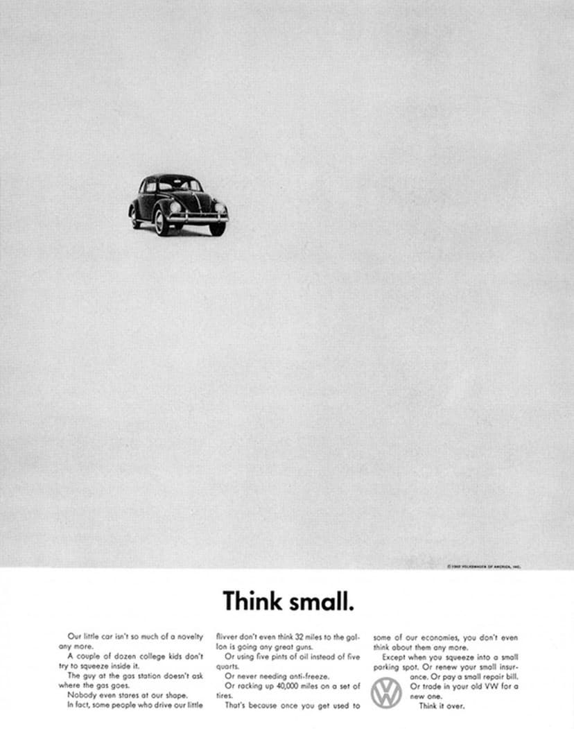
'Think Small', 1959
Helmut Krone and Julian Koenig, DDB
Mostly whitespace in an era of excess. Ranked the greatest ad campaign of the century.
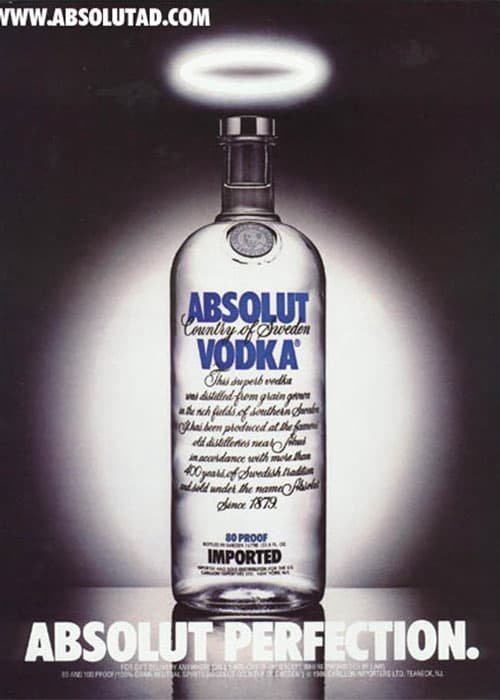
'Absolut Perfection', 1981
TBWA
A bottle and a halo. The first of over 1,500 print ads in a 25-year campaign.
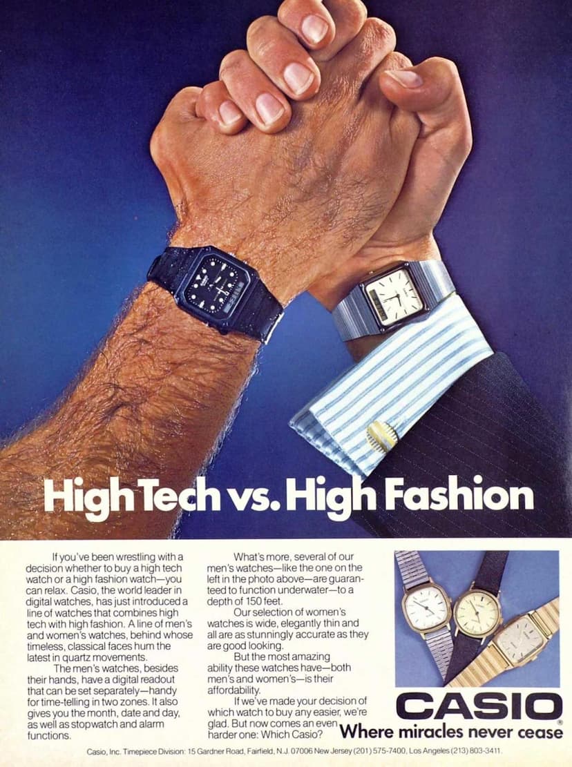
'High Tech vs. High Fashion', 1984
Casio
The arm wrestle that made digital watches fashionable.
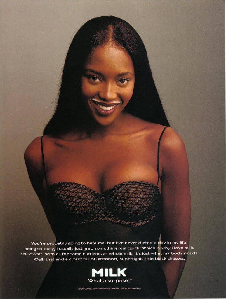
'Got Milk?', 1993
Goodby Silverstein and Partners
Photographed by Annie Leibovitz. 350 milk mustache ads. 90% consumer awareness.
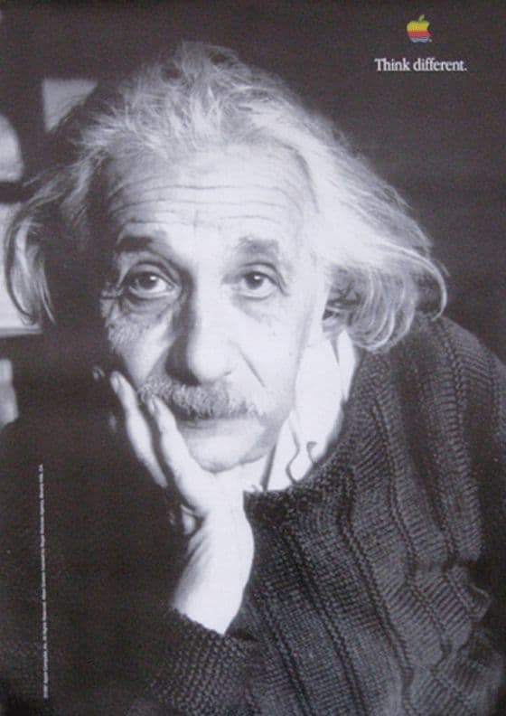
'Think Different', 1997
TBWA/Chiat/Day for Apple
29 posters that turned a failing computer company into a cultural movement.
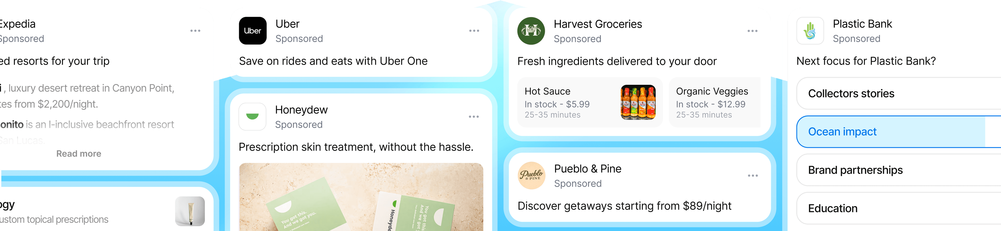
How ads got ugly
Early web ads actually started like newspaper ads. A small banner at the top of the page. Modest. Relevant enough. It blended in because the web was still simple.
Then someone discovered you could add another banner. And a pop-up. And an interstitial before the content even loaded. Every pixel of screen became real estate to be auctioned. The ads did not spread because users wanted more of them. They spread because there was no one to say no.
The result was a page where the content became the minority. Ads took up more space than the thing you came to read. Over two decades, we internalized a belief that now feels universal: ads are annoying, and that is just how it is.
The web gave advertising reach, scale, and measurability that print never had. But it removed the constraint that kept ads honest.
Where we are now
AI is reshaping all digital interfaces.
The web is becoming more fluid and generative. User expectations are shifting with it. People want interfaces that work for them, not against them. The static, fixed-dimension ad formats the industry agreed on over the last two decades were not built with this flexibility in mind.
This forces a return to first principles. When the old formats do not fit, you have to ask the question: what actually makes a good ad?
We think a good ad follows a few principles:
Principles of a good ad
A good ad is relevant.
It resonates with you as a human.
A good ad is native.
It feels like it belongs in the experience. Not bolted on.
A good ad is brief.
It says what it needs to and gives you space.
A good ad is honest.
It is clearly an ad. No dark patterns.
A good ad is useful.
It surfaces something you would have looked for anyway.
A good ad is quiet.
It does not shout, flash, or interrupt. It earns attention instead of demanding it.
Beyond the format
The newspaper editor understood these principles intuitively. The web forgot them. So the question becomes: how do we bring them back?
Think of a good concierge. When you are browsing, they stand back. Present, patient, not in the way. The moment you lean in, they meet you there. They follow your curiosity. They go deeper when you go deeper.
That is what Koah is building. Not an ad forced on the user, but ones that shaped by them. Here is a sneak peek of our work towards this vision.
Hey, I'm the Patagonia guide. Ask me anything about our gear — I'll help you find exactly what you need.
Start exploringInteractive demo
We started by breaking down what an ideal sponsored experience feels like, down to its smallest parts. Then we built it back up around the user. Every piece is there for a reason. To surface a product when you want one. To answer a question when you have one. Just like a good concierge.
And because we are working with atoms, not fixed formats, the experience adapts to wherever it lives. An AI assistant. A traditional blog. A product page. The building blocks are the same. How they assemble depends on the surface and the user.
What to expect from us
User expectations around ads have been evolving for over a century. From lithographs to pop-ups to whatever comes next. The medium changes. The standard should only go up.
Ads were never supposed to take away from the experience.
The best ones add to it.
That is what Koah is building towards.