Evolving Koah's Brand
Today we're excited to share how we are evolving the Koah brand.
Why now
Koah is not the company it was a year ago.
We closed a $20.5M Series A led by Theory Ventures. The team is bigger. We process millions of queries and native ad impressions every month. The industry moved too. AI is now how people discover, research, and decide.
That changes what sponsored content has to be. Legacy ad platforms were built for static pages, cookies, and fixed banner sizes. They were never built for generative inputs, real-time context, or native formats inside a chat.
In the age of genAI, ads have to earn their place in the conversation. They must be matched to intent at the moment it matters, native to the surface, and never bolted on after the fact.
We've been hard at work building the products for this new world and we wanted our brand to match our aspirations.
The mark
![]()
Today our logo reflects our vision for the future of sponsored content.
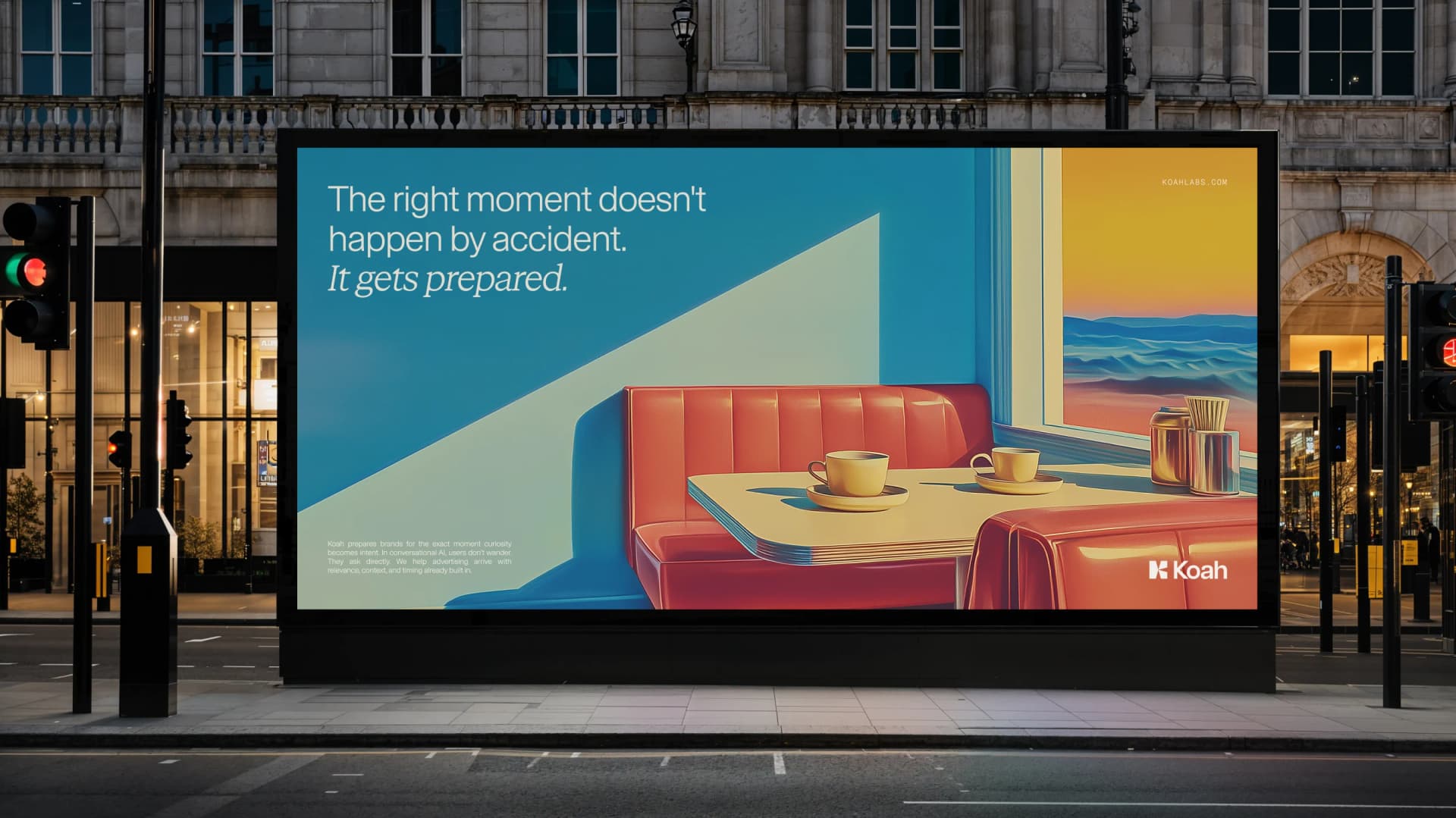
Picture the perfect moment: finding yourself in "the right place at the right time", like catching the sunlight through a window just before it shifts.
That is how we want sponsored content to feel: intentional, placed with care, never an interruption. An unexpected delight.
The geometry follows the same logic. Three planes meeting at deliberate angles: the way light catches an edge, splits across a surface, and refracts into something richer as it travels.
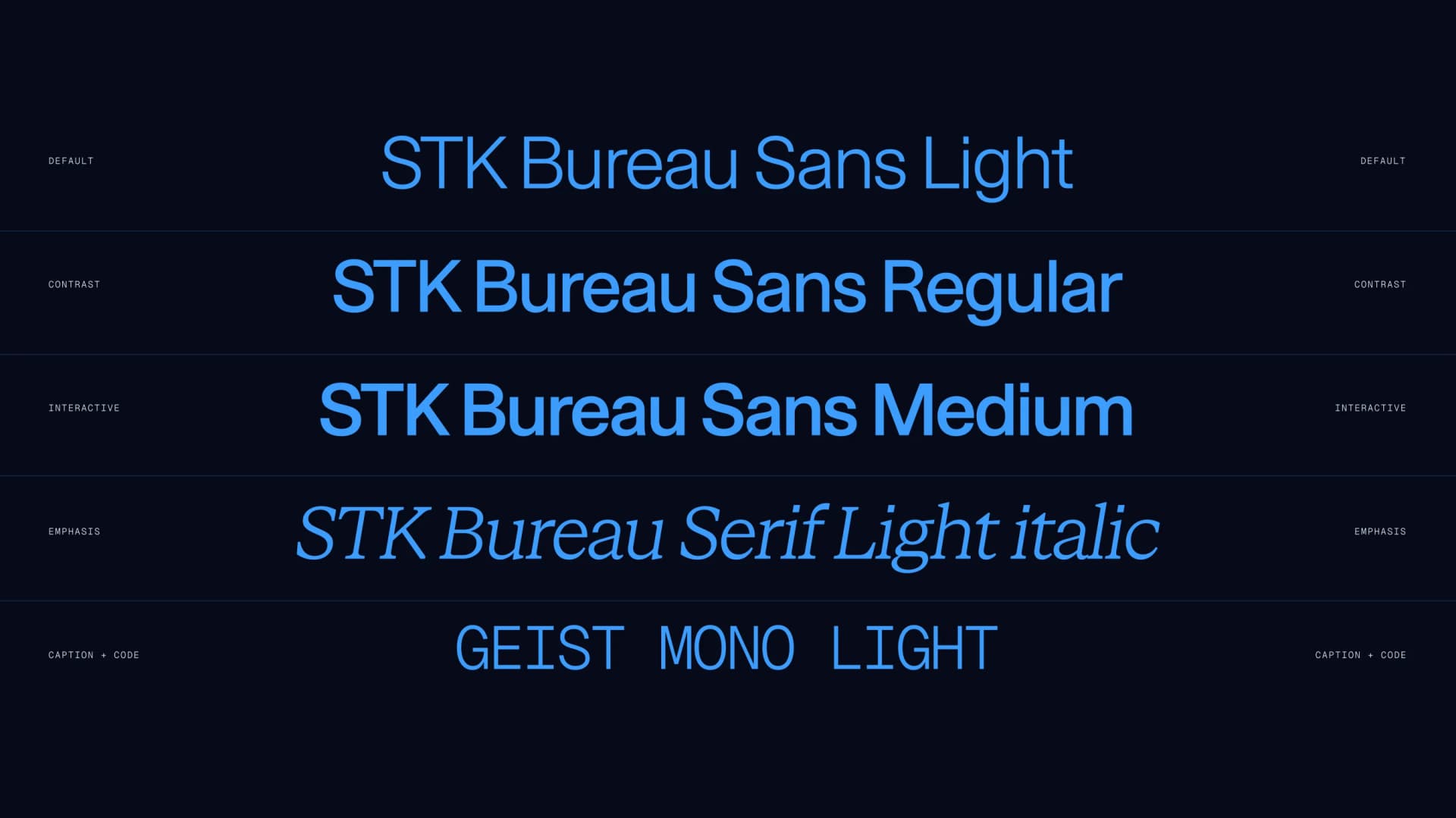
Type
STK Bureau Sans carries headlines and UI, clean, structured, built for clarity at speed.
STK Bureau Serif handles our editorial moments.
Geist Mono stays small and out of the way for captions, code, and metadata.
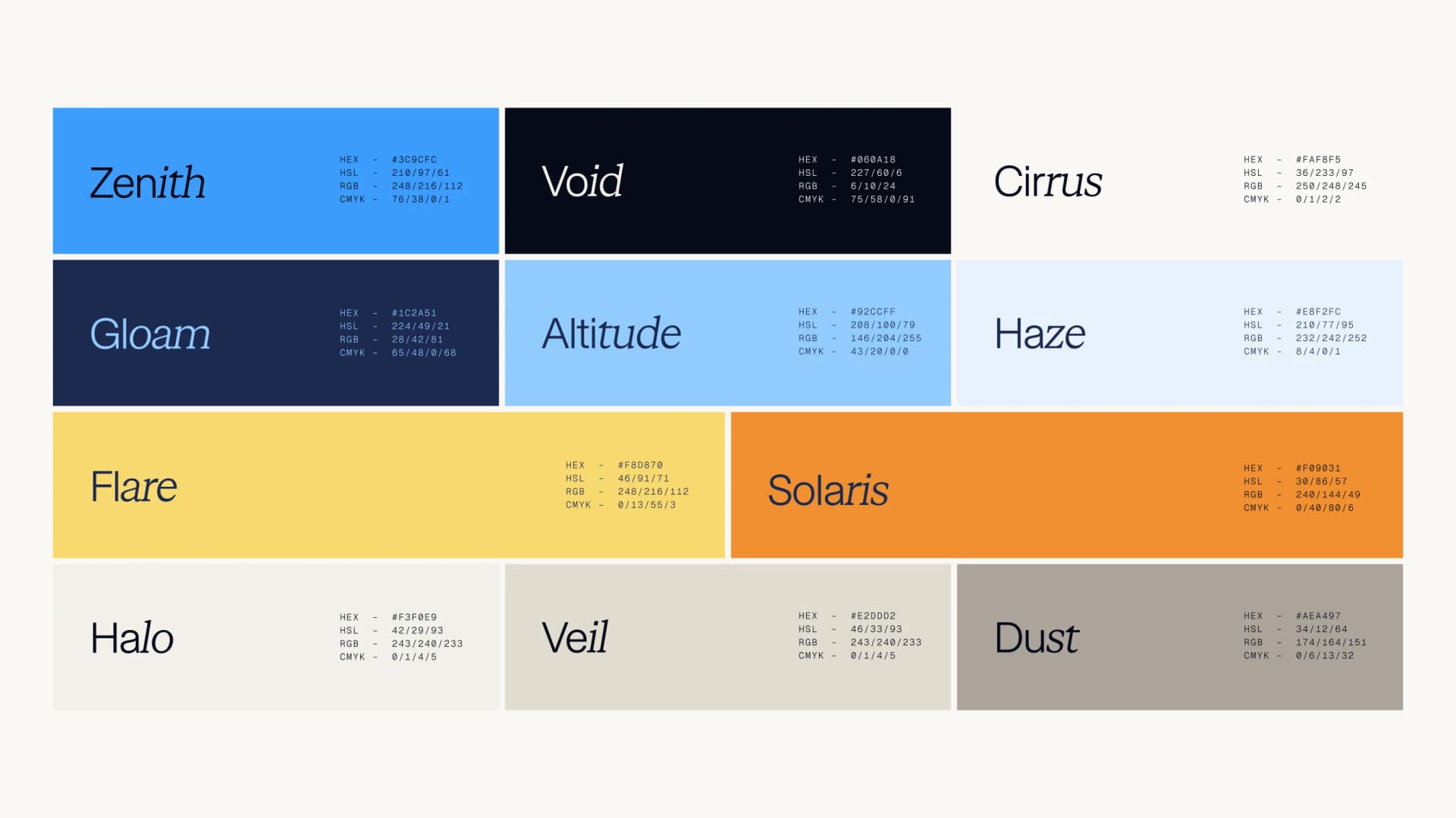
Color
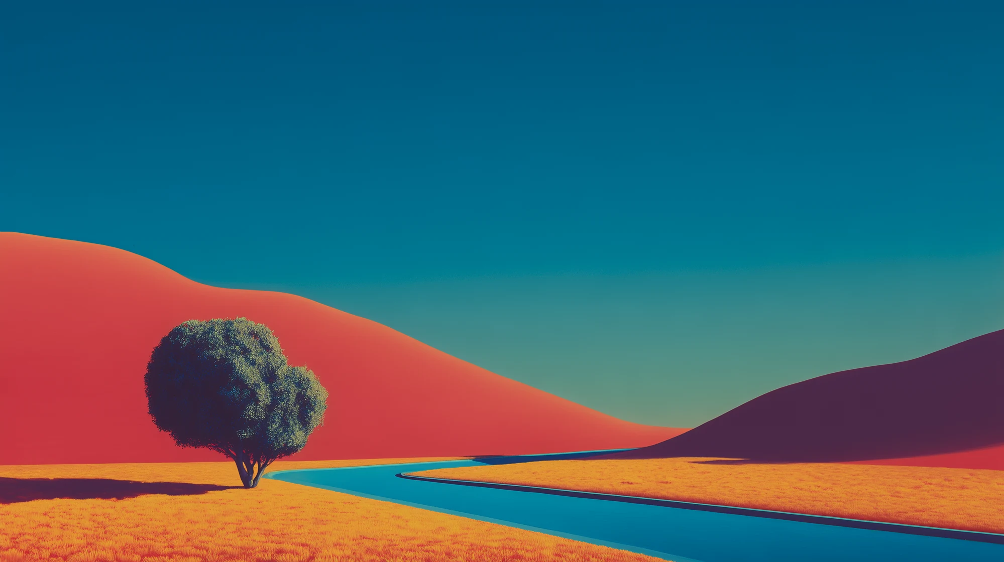
Building on our theme of "the Perfect Moment", our new palette was born from natural colors you'll find in the sky.
We extracted them from instants when light does something unrepeatable: dawn powder blue and amber horizon, midday cerulean and high-contrast shadow, dusk golden coral deepening into night.
We use deep gloam for text, bright zenith for accent, cream cirrus for surfaces, golden flare for the moments that ask you to act, and warm neutrals for everything in between.
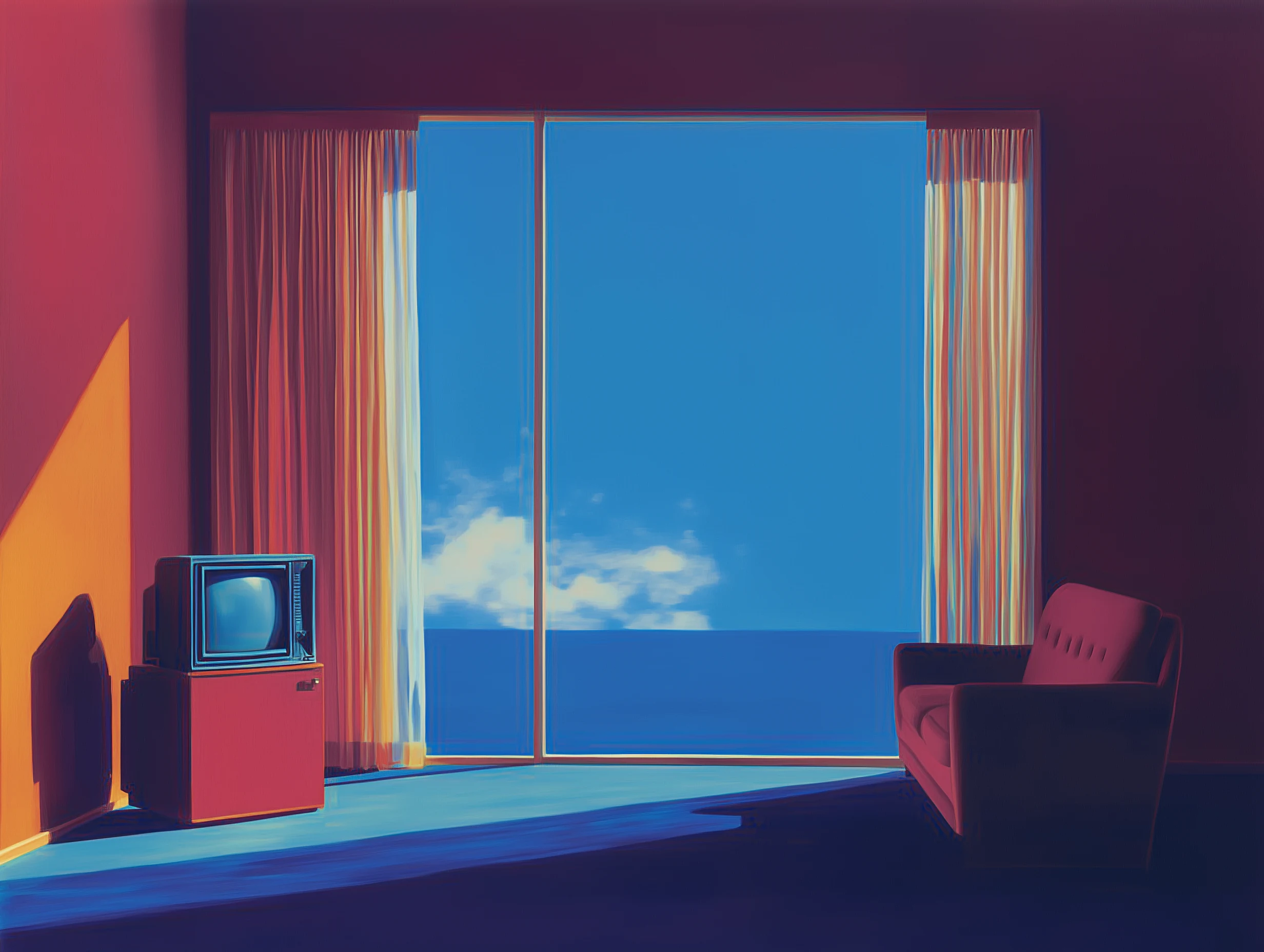
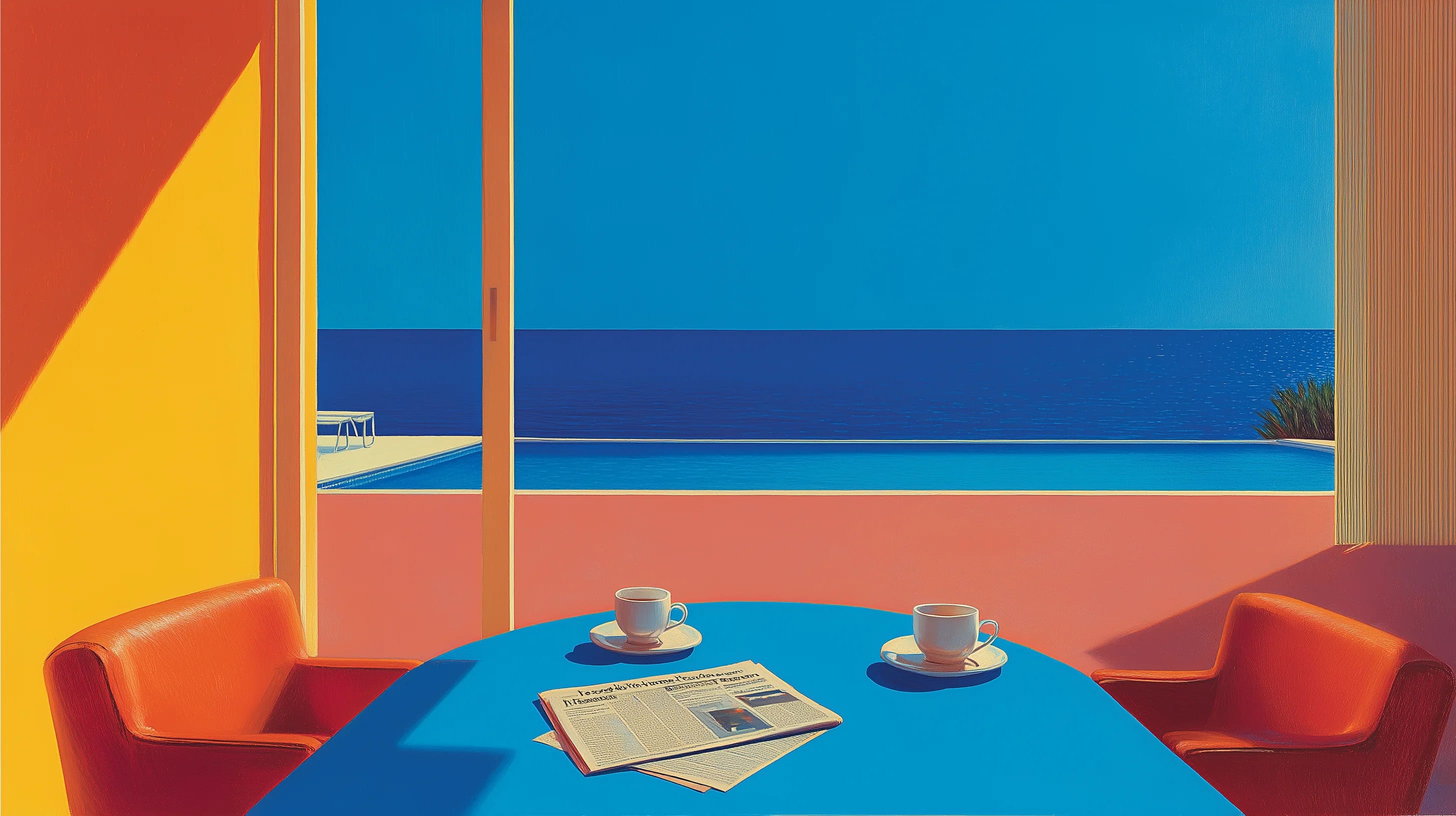
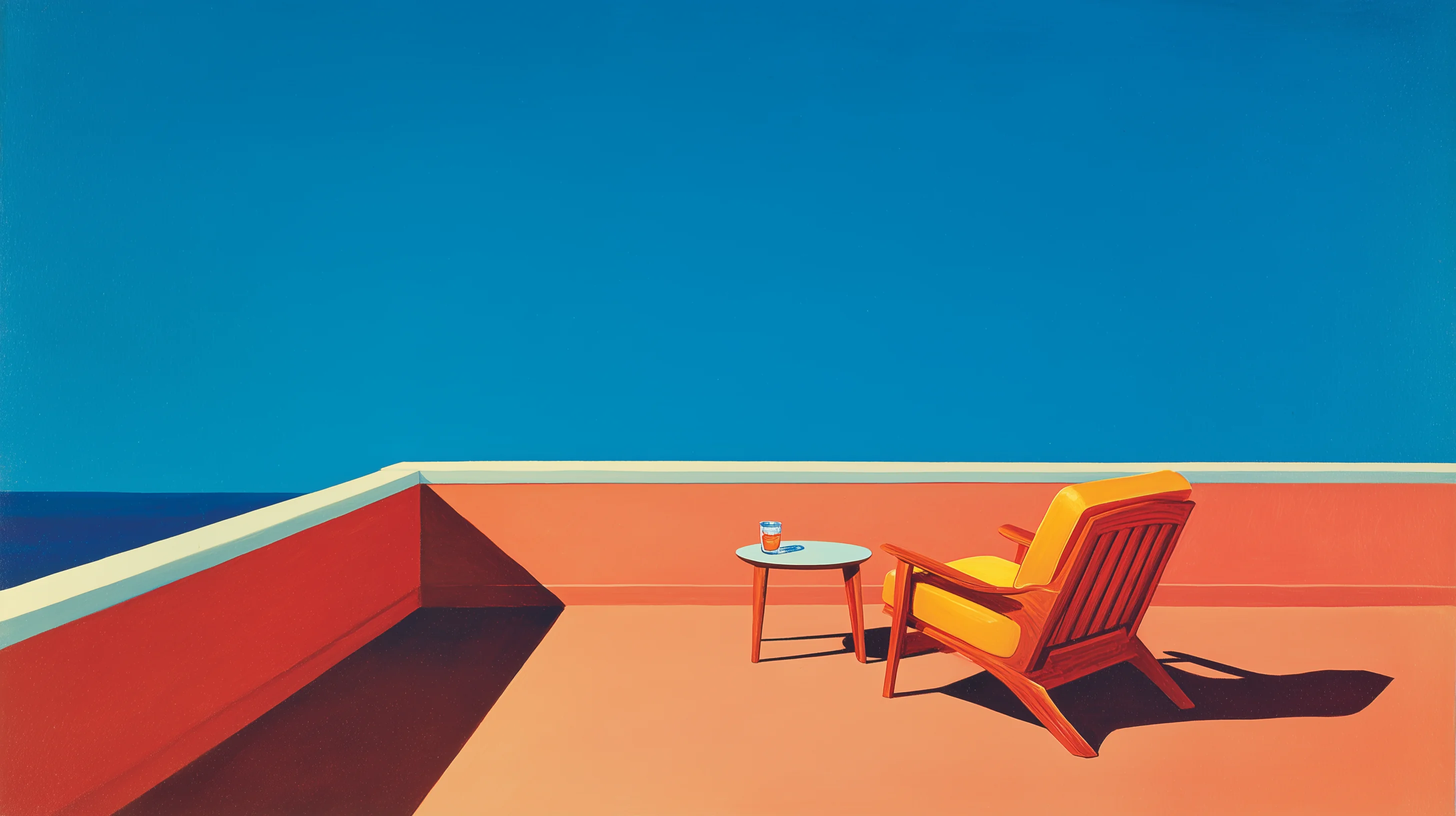
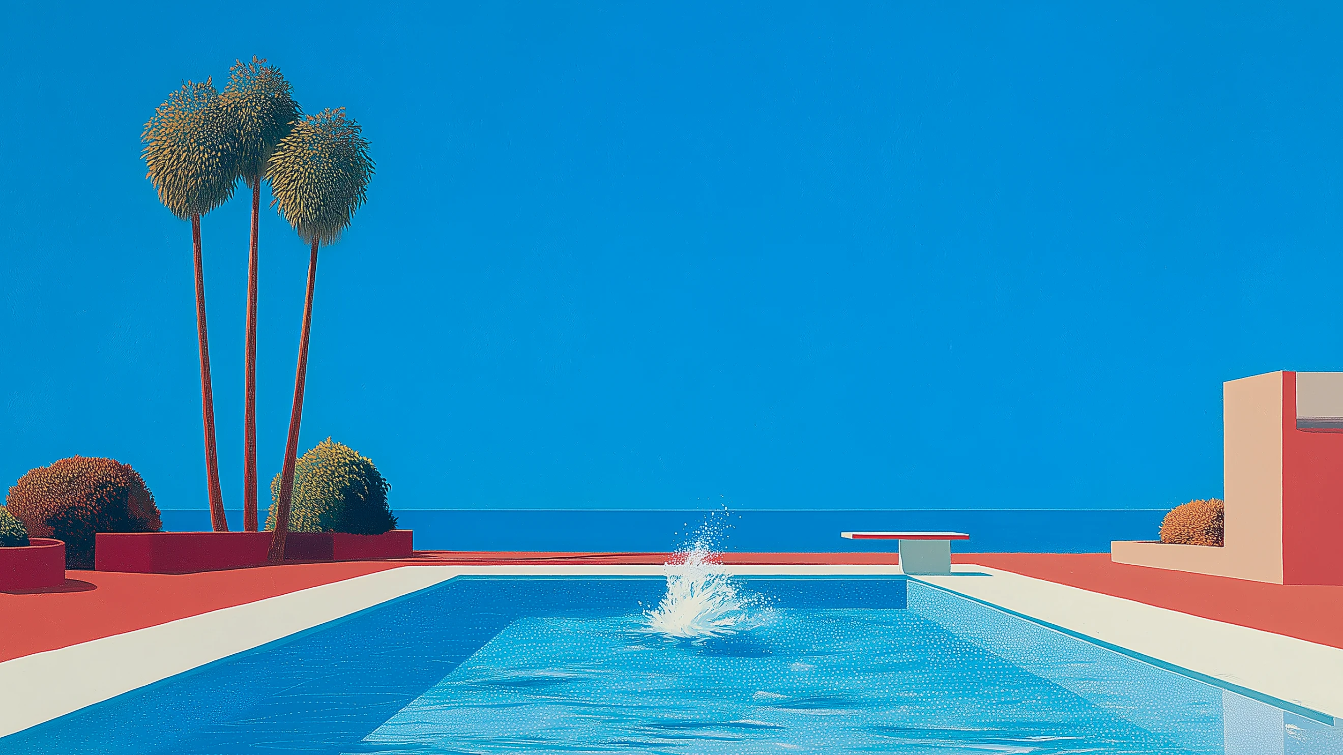
Imagery
Inspired by the feeling of vintage advertising — and the work of Edward Hopper and the late David Hockney.
Hopper gave us the charged stillness. Hockney gave us the painterly light.
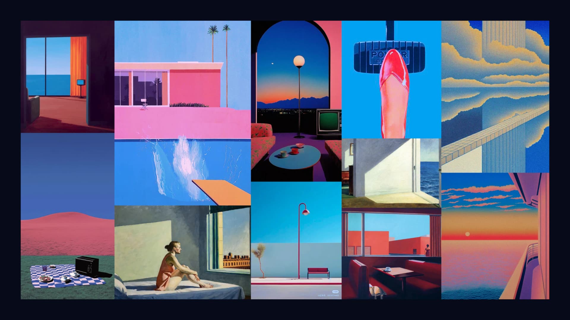
Then we made our own images. Our scenes sit between photographic and illustrated. They have bold color planes meeting at precise angles and directional light casting geometric shadow. We also used subtle film grain referencing 1960s color photography.
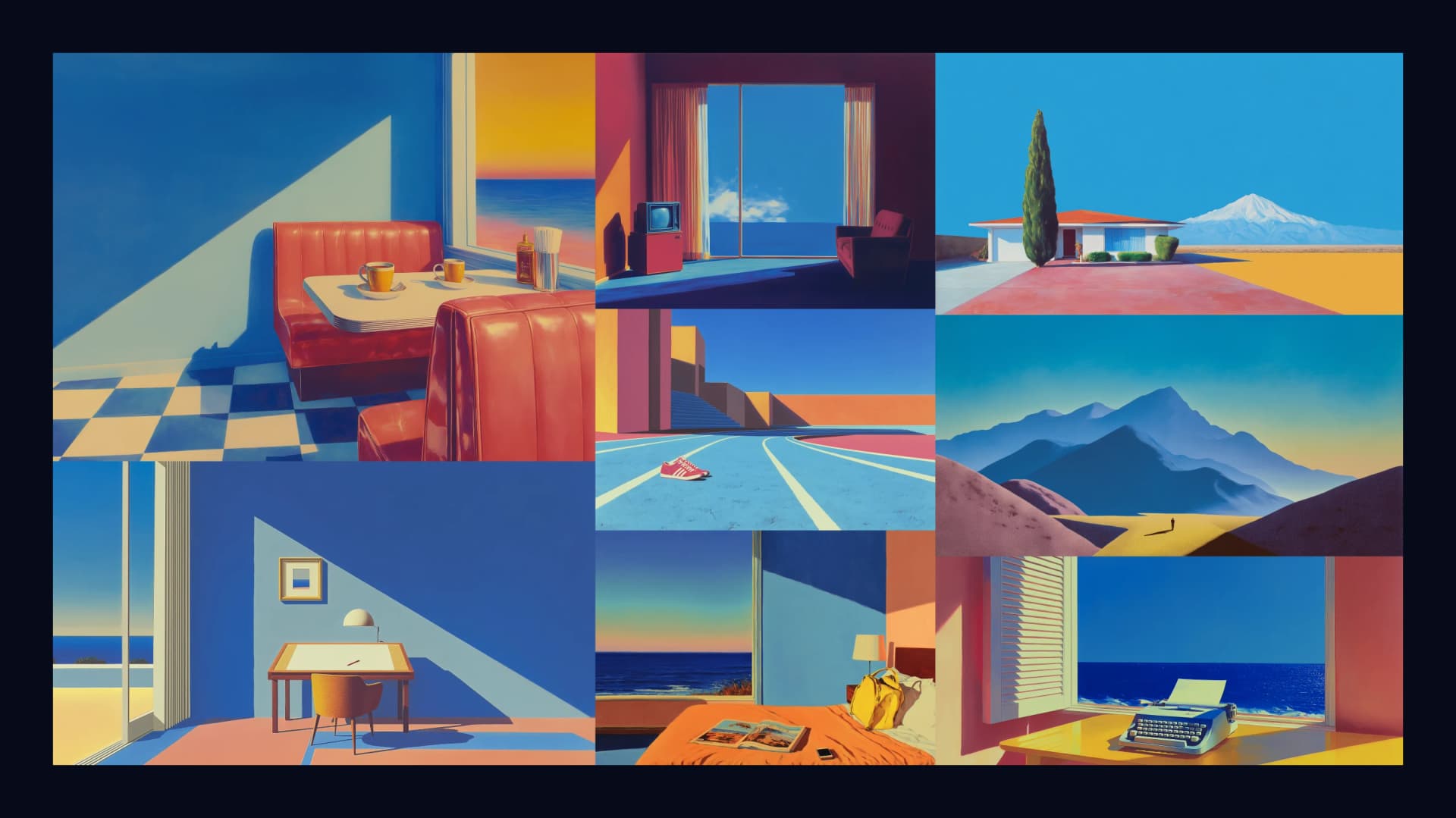
David Hockney passed away recently, and his influence runs through how we think about Koah imagery: not as decoration, but as a way to make a fleeting instant feel worth stepping into. The through-line is always the same feeling: I want to be there.
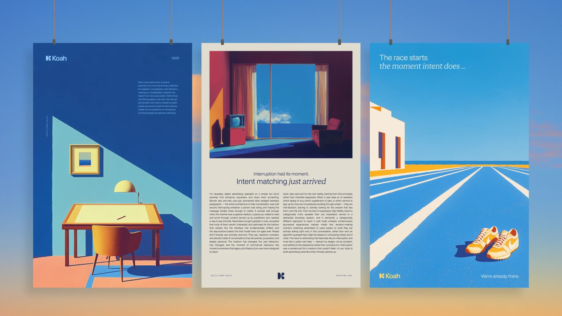
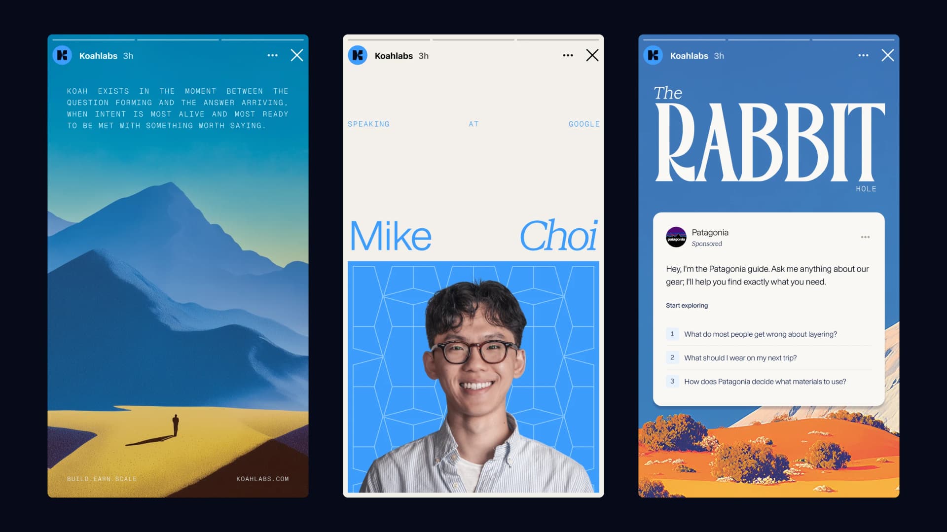
Execution
Finally, we had some fun putting the new system to work.
Where we're headed
We are just getting started. We're excited to bring this brand into places we haven't shown yet: in-product surfaces, case studies, campaigns, and the next generation of formats we're shipping for AI-native applications.
If you want to see how native, intent-matched ads actually feel inside an AI app, book a demo or get in touch.
Shoutout
Huge shoutout to Chris Reilly, Isabelle Rossi de Leon, Katie Donham, and Mike Choi, and the whole Koah team for the work that went into this brand and our latest products.